The Family
Branding
2022
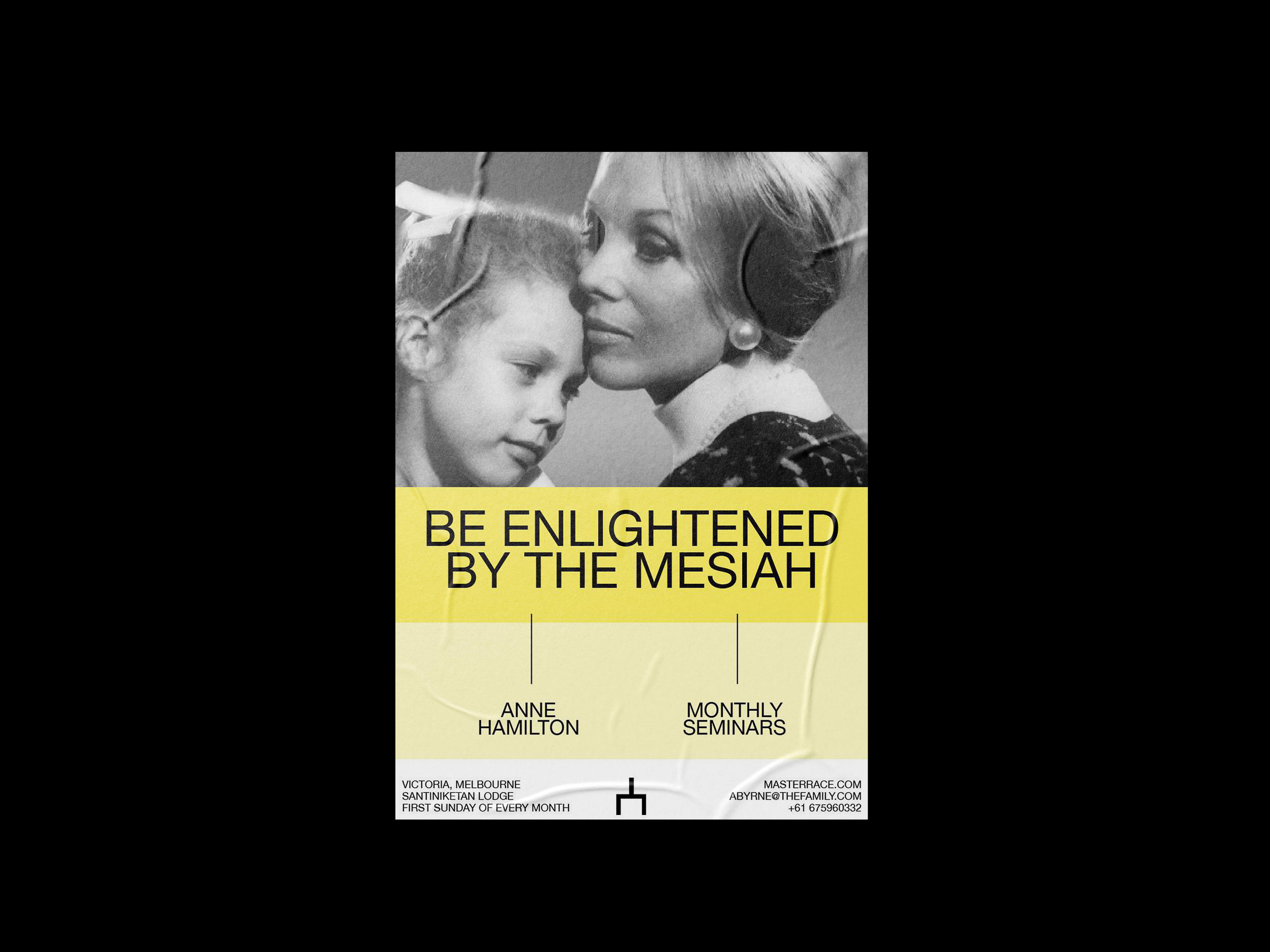
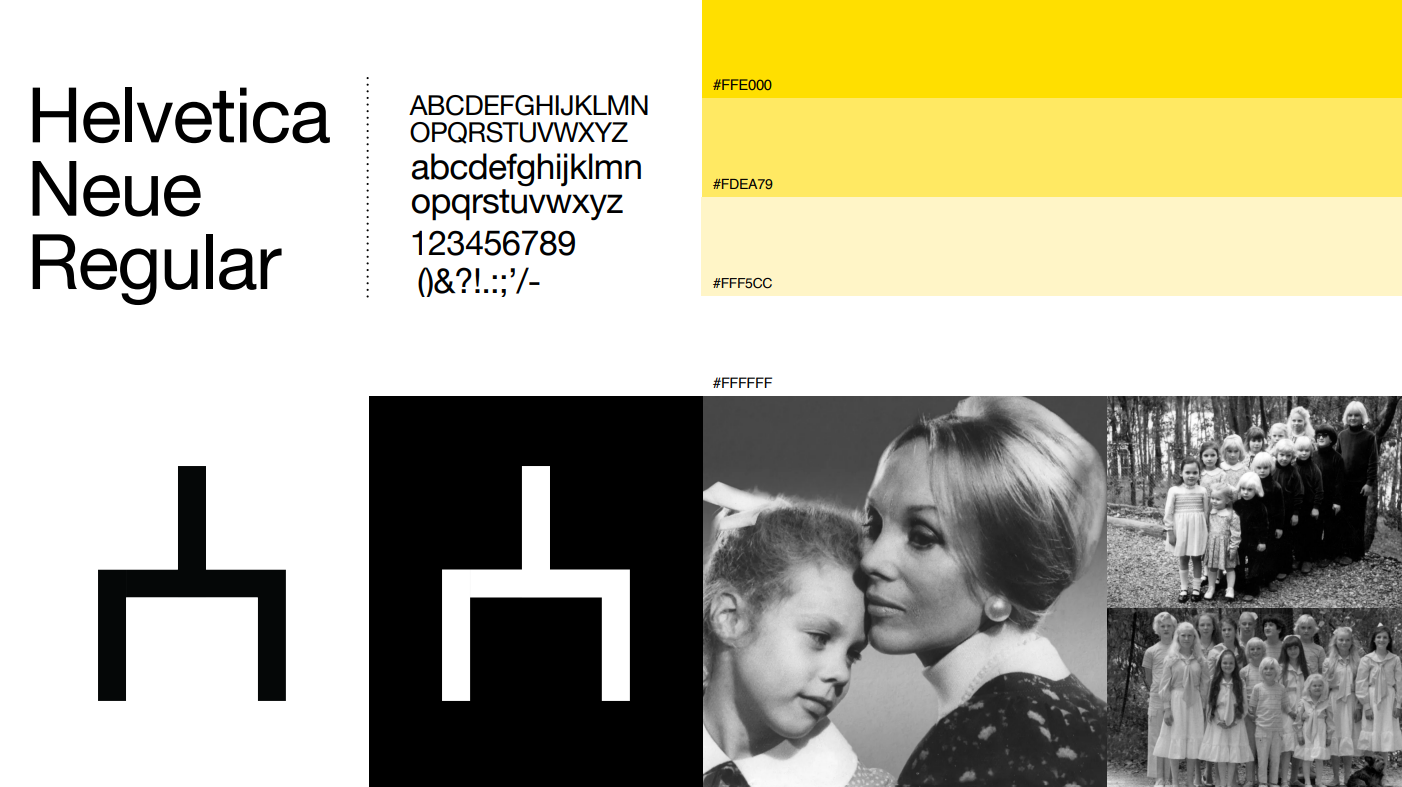
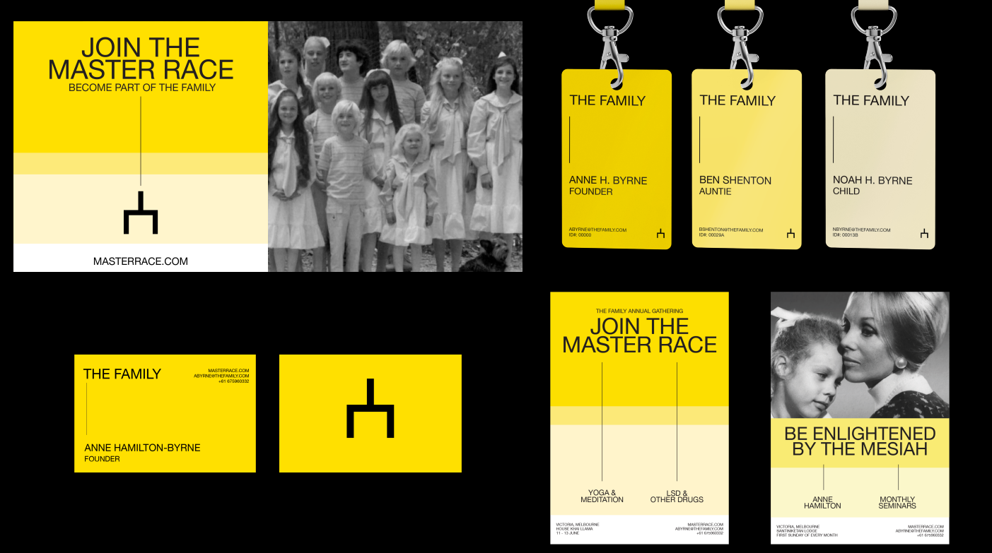
This project is the construction of a hypothetical brand identity for an inactive cult, in which every design element (symbol, color palette, grid, typography, and image style) and their applications had to be a visual materialization of the sect’s philosophy, history and values.
Abstract concepts such as enlightenment were explored and conceptualized visually in order to create a cohesive, identifiable and dynamic grid that could work when applied to various different material and visual elements.
The process consisted of three phases: discover, define and design. This design methodology allows for the development of strong visual identities that have a solid theoretical and critical foundation. The concept development phase of this project is what makes the design system dynamic and applicable across different mediums.
tools used:
i. photoshop
ii. illustrator
iii. indesign